top of page


Books Over Borders
Website Redesign
NATURE OF WORK
UI/UX Design
ROLE
Product Designer
UX Audit, Information Architecture, Visual Design,
Prototype, WordPress Development
DURATION
8 weeks
60 hours
OVERVIEW
A Canada-based NGO wanted a website redesign to increase its credibility and make its value more evident to the donor. The new website gives visitors a clear understanding of what Books Over Borders does so they can make the call to contribute.
IMPACT
Donations increased by 28%
THE PROCESS

DESIGN BRIEF
The Books Over Borders website needed a revamping to make it visually captivating for the visitor and bring about a rise in their online donations.
ORGANISATIONAL GOALS
a) Increased donation
b) Retention
c) Least steps to donation
d) Appealing aesthetics

The video below shows a snippet of the old website.
USER PERSONA
Alex is a 48-year-old woman working in Canada, looking to donate to a good cause.
USER GOALS
-
She can understand what cause the organisation is working towards.
-
She can see their efforts and impact towards the cause.
-
Her donation (payment) experience is hassle-free.
-
She gets a tax exemption certificate against the donation she made.
USER JOURNEY MAPPING

INSPIRATION BOARD & THE BIG QUESTIONS
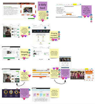
The visual below is an Inspiration Board derived from a competitor analysis to understand what makes an NGO communicate its purpose, efforts and impact in the best possible way.
The 'How Might We's that stood out:

IDEATION, FEATURE MAPPING AND IDEA SELECTION
After several rounds of ideation, I selected ideas that met the most requirements.
The images below show the ideation and selection process.

Success Criteria / Requirements:
1) Fulfills a user goal; is user-friendly.
2) Delights the user; allows for a memorable experience.
3) Fulfills organisation goals; makes it easy for the board members to maintain the website.
4) Enables lean development.
INFORMATION ARCHITECTURE USING CHOSEN IDEAS

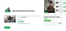
1) A visitor must understand the need in the first few seconds through an appealing or contrasting image of children and significant stats that amplify the need.
2) The efforts and impact made through donations should be highlighted as numbers and stats.


3) Urgent or ongoing projects can appear on the homepage as current initiatives.
4) End the homepage with testimonials by donors and partners.
.png)

5) Publish insightful and heart-warming stories as news feeds or blog posts.


6) It’s easier for visitors to select a pre-filled amount to donate, rather than figure out how much they want to donate. Along with those figures, we could show what it translates to regarding books. For example, $50 will provide books to 10 kids or $50 will bring 20 books to the children in Afghanistan.

.png)
VISUAL DESIGN GOALS
1) Highlights the crucial elements
2) Fuels the curiosity of the visitor while giving them a novel experience
3) Relates to books and the world of stories
KEYWORDS
Books, Children ,Stories

STORIES AS INSPIRATION:
-
Transport you to a different world
-
Spark imagination
-
Bring people closer
-
Dramatic elements grab attention and stimulate mental activity
Purple as a colour represents :
-
Power
-
Magic
-
Mystery
-
Wisdom
-
Creativity
It combines the stability of blue with the energy of red.


MOCK-UPS


EXPERIENCE WITH WORDPRESS DEVELOPMENT
Highlights:
1) I enjoyed the fact that I was building a website on my own from scratch.
2) Elementor for WordPress is a much better tool with many more customisation options, which I found lacking in Wix Editor. I'm sure you realised that with my website.
3) Shawn, the BOB board member whom I coordinated with, was extremely supportive during the whole journey and gave valuable feedback and tips about WordPress limitations and requirements.
4) Working with Elementor and WordPress was like an eye-opener for me. It made me realise how I need to explore and exploit each new tool I use.
Challenges:
1) WordPress doesn't allow for placing text strategically on top of images, like on the landing page carousel. I used Canva to add text to the images and then added that to the website. The sharing features of Canva also allow the board members to update the text or images easily.
2) I did the same for the testimonials since that kind of layout was not achievable on WordPress.
3) Spacing became a huge issue when it came to making the header 'floating'. The floating header kept overlapping the content below it, so I had to add a huge buffer padding. So whenever someone opens any page on the website, you'll first see a huge gap between the header and the rest of the content, but when the website loads completely, it disappears. I hope someone's figured out a better way to do this.
bottom of page